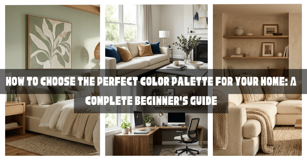
Choosing a color palette is one of the most important decisions you’ll make when decorating your home. The right colors can make your home feel warm, spacious, relaxing, or elegant, while the wrong combination can make even the most beautiful furniture and decor look disconnected.
Many homeowners struggle with questions like:
- Which colors work well together?
- How many colors should I use?
- Should every room have the same color?
- How do I create a home that feels cohesive?
The good news is that creating a beautiful color palette doesn’t require a degree in interior design. By understanding a few simple principles, you can confidently choose colors that reflect your personal style while creating harmony throughout your home.
In this guide, you’ll learn everything you need to know about choosing the perfect color palette—from understanding color relationships to applying the popular 60-30-10 rule used by professional interior designers.
What Is a Color Palette?
A color palette is a carefully selected group of colors used throughout a room or an entire home.
Instead of choosing colors randomly, a palette creates a coordinated look where every element works together.
A home color palette typically includes:
- Primary colors
- Secondary colors
- Accent colors
These colors appear in different proportions across walls, furniture, textiles, artwork, and decorative accessories.
Why a Color Palette Matters
A well-planned color palette helps your home feel:
- Cohesive
- Balanced
- Comfortable
- Professionally designed
- Timeless
Without a clear palette, rooms can feel disconnected and visually cluttered.
Step 1: Start With Your Home Decor Style
Your decorating style should guide your color choices.
Different styles naturally favor different palettes.
Modern
Often uses:
- White
- Gray
- Black
- Neutral tones
Scandinavian
Popular colors include:
- White
- Soft gray
- Beige
- Light wood tones
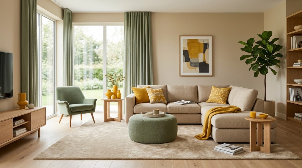
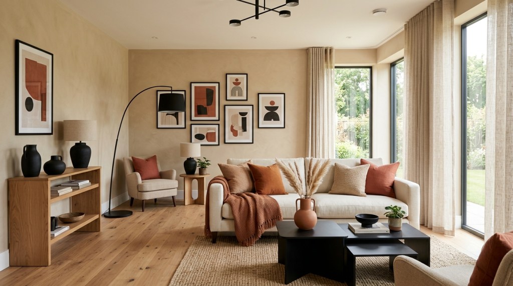
Boho
Typically features:
- Terracotta
- Sage green
- Mustard
- Cream
- Earth tones
Farmhouse
Often combines:
- Warm white
- Beige
- Soft green
- Natural wood
Traditional
Frequently uses:
- Navy blue
- Rich green
- Cream
- Warm brown
If you haven’t chosen your decorating style yet, read:
How to Choose a Home Decor Style
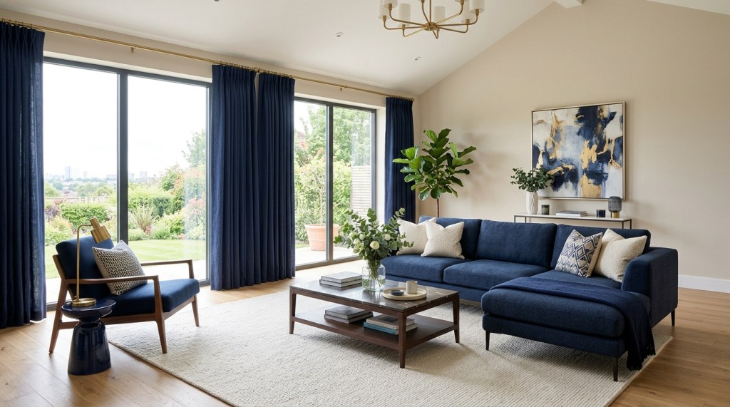
Step 2: Understand the 60-30-10 Rule
One of the simplest and most effective design principles is the 60-30-10 rule.
This rule creates visual balance by dividing colors into three proportions.
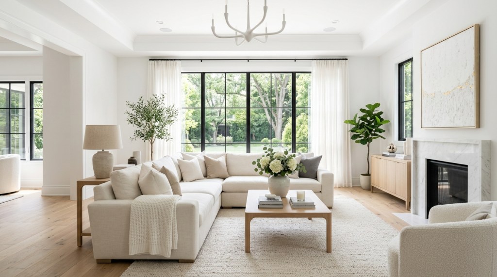
60% – The Dominant Color
This is the main color in the room.
It usually appears on:
- Walls
- Large furniture
- Flooring
- Large rugs
Examples:
- White
- Beige
- Light gray
- Soft cream
30% – The Secondary Color
This color supports the dominant color.
It often appears in:
- Sofas
- Curtains
- Accent chairs
- Bedding
Examples:
- Sage green
- Navy blue
- Taupe
- Warm gray
10% – The Accent Color
Accent colors provide personality and contrast.
Examples include:
- Mustard yellow
- Terracotta
- Black
- Gold
- Olive green
Use them in:
- Cushions
- Artwork
- Vases
- Throws
- Decorative accessories
Small accents make a big impact without overwhelming the room.
Step 3: Consider Your Home’s Natural Light
Light changes the way colors appear.
Before choosing paint or furniture, observe your room throughout the day.
North-Facing Rooms
Receive cooler, softer light.
These rooms often benefit from:
- Warm white
- Beige
- Cream
- Warm gray
South-Facing Rooms
Receive abundant natural light.
Most colors work well here, including:
- White
- Sage green
- Blue
- Gray
East-Facing Rooms
Receive warm morning sunlight and cooler afternoon light.
Soft neutrals and gentle earth tones work beautifully.
West-Facing Rooms
Receive warm afternoon and evening sunlight.
Balanced neutral colors help prevent the room from feeling overly warm.
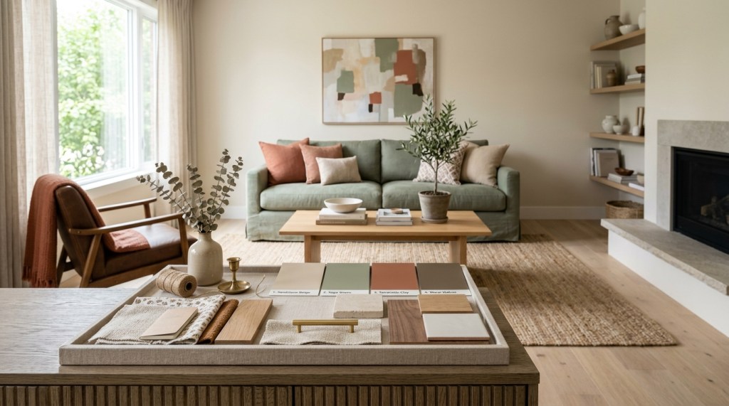
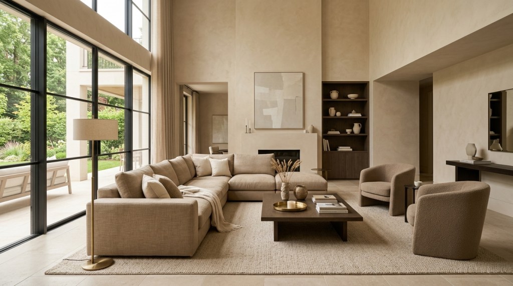
Step 4: Choose a Base Neutral
Most successful interiors begin with a neutral foundation.
Popular base colors include:
- White
- Warm white
- Beige
- Greige
- Light gray
- Taupe
Neutral colors allow furniture, artwork, and accessories to stand out.
Step 5: Add One or Two Accent Colors
Once your neutral base is established, introduce color thoughtfully.
Examples:
White + Sage Green + Oak Wood
Creates:
- Freshness
- Calmness
- Natural beauty
Beige + Terracotta + Black
Creates:
- Warmth
- Modern elegance
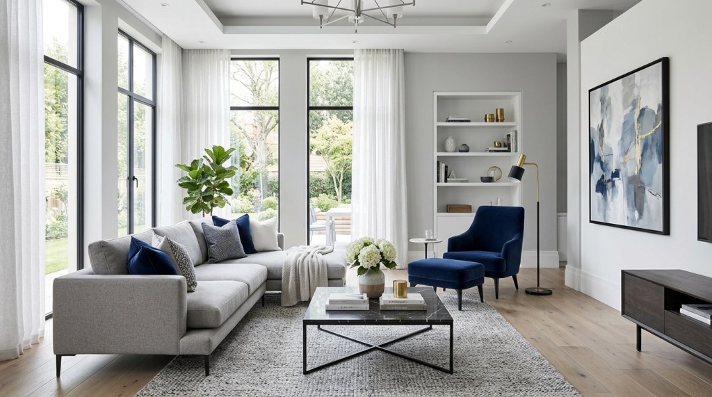
Gray + Navy Blue + White
Creates:
- Sophistication
- Timeless appeal
Cream + Olive Green + Wood
Creates:
- Organic warmth
- Relaxing atmosphere
Choose accent colors that complement your lifestyle and preferences.
Step 6: Think About Mood
Different colors create different emotional responses.
For Relaxation
Choose:
- Blue
- Sage green
- Beige
- Soft gray
Perfect for:
- Bedrooms
- Reading corners
For Energy
Choose:
- Yellow
- Terracotta
- Warm orange
Ideal for:
- Kitchens
- Dining rooms
For Elegance
Choose:
- Navy blue
- Charcoal gray
- Black accents
Suitable for:
- Living rooms
- Dining rooms
For Warmth
Choose:
- Beige
- Taupe
- Clay
- Camel
Great for family spaces.
For a deeper understanding, read:
Color Psychology in Home Decor: How Colors Affect Mood
Step 7: Use Color Consistently Throughout Your Home
A cohesive home doesn’t require every room to be the same color.
Instead, repeat key colors in different ways.
For example:
If your living room features sage green cushions, you might use sage green in:
- Bedroom artwork
- Bathroom towels
- Dining room plants
- Kitchen accessories
Repeating colors creates visual flow.
Step 8: Balance Warm and Cool Colors
A balanced home usually includes both warm and cool tones.
Examples:
Warm elements:
- Beige
- Terracotta
- Wood
Cool elements:
- Blue
- Gray
- Green
Combining both creates depth and harmony.
Step 9: Test Paint Samples Before Committing
Paint colors often look different in real homes than they do on paint chips or computer screens.
Before painting an entire room:
- Purchase sample pots
- Paint large test areas
- Observe them in morning, afternoon, and evening light
This simple step can prevent costly mistakes.
Popular Whole-Home Color Palettes
Here are some combinations that designers frequently use.
Palette 1: Soft Modern
- Warm White
- Light Gray
- Black
- Oak Wood
Creates:
- Clean elegance
- Modern simplicity
Palette 2: Nature Inspired
- Sage Green
- Cream
- Beige
- Warm Wood
Creates:
- Calmness
- Freshness
- Organic beauty
Palette 3: Timeless Neutral
- Beige
- Taupe
- White
- Brown
Creates:
- Warmth
- Comfort
- Versatility
Palette 4: Coastal
- Soft Blue
- White
- Sand
- Driftwood
Creates:
- Airiness
- Relaxation
- Freshness
Palette 5: Modern Luxury
- Greige
- Navy Blue
- Gold
- White
Creates:
- Sophistication
- Rich contrast
Common Color Palette Mistakes
Using Too Many Colors
Stick to a limited palette for a more harmonious look.
Ignoring Existing Furniture
Your walls should complement—not compete with—your furniture.
Following Trends Without Considering Your Lifestyle
Choose colors you’ll enjoy for years, not just what’s currently fashionable.
Forgetting Texture
Even a neutral palette can feel rich and inviting when layered with:
- Wood
- Linen
- Wool
- Woven materials
- Metal accents
Painting Before Planning
Choose your largest furniture pieces first whenever possible.
It’s much easier to match paint to a sofa than to match a sofa to a painted room.
A Simple Formula for Beginners
If you’re unsure where to begin, follow this easy approach:
Choose:
- One neutral base color
- One secondary color
- One accent color
Repeat these colors throughout your home using furniture, rugs, curtains, artwork, and decorative accessories.
This simple strategy creates a polished and cohesive appearance.
How This Connects to Other Design Principles
Creating the perfect color palette becomes much easier when you understand:
- Color psychology
- Texture
- Scale
- Balance
- Home decor style
For more guidance, read:
- What Is Home Decor? A Complete Beginner’s Guide
- How to Choose a Home Decor Style
- Understanding Scale & Proportion in Interior Design
- Balance & Symmetry: Why Some Rooms Feel “Off”
- Texture in Home Decor: How Wood, Metal, Fabric, and Other Materials Transform a Space
- Color Psychology in Home Decor: How Colors Affect Mood
Together, these guides will help you create a home that feels intentional, balanced, and uniquely yours.
The Bottom line
Choosing the perfect color palette isn’t about finding the “right” colors—it’s about selecting colors that work together and support the way you want your home to feel.
Start with a neutral foundation, use the 60-30-10 rule, consider your home’s natural light, and repeat colors throughout different rooms to create a cohesive design. Most importantly, choose colors that reflect your personality and fit your lifestyle.
A thoughtfully planned color palette will make decorating easier, reduce costly mistakes, and create a home that feels harmonious from one room to the next.

Leave a comment