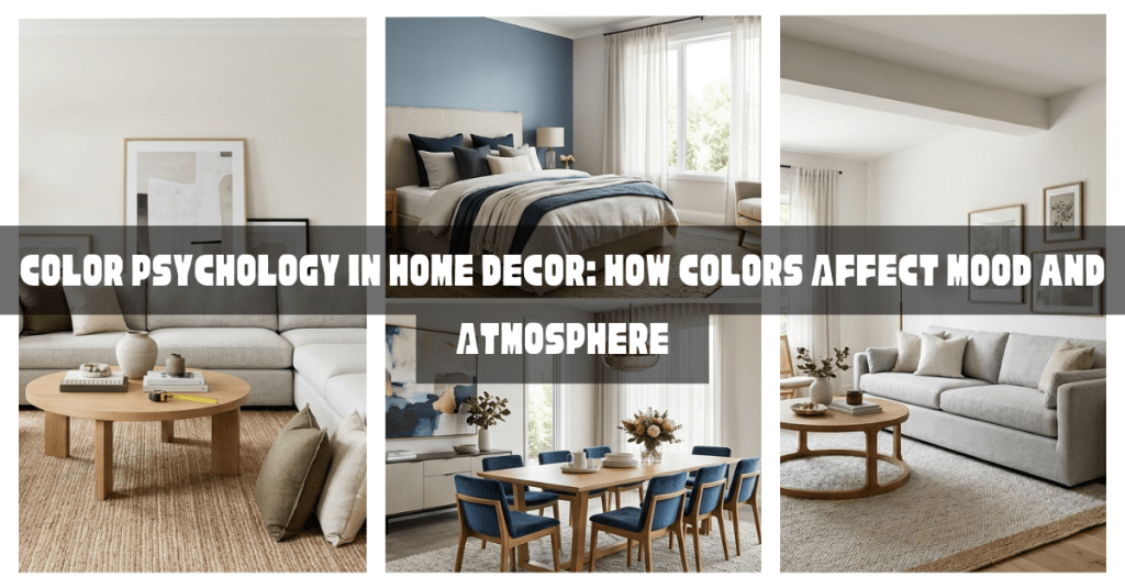
Color is one of the most powerful tools in home decor. It influences how a room looks, feels, and even how people behave within it. The same room can feel cozy, energetic, relaxing, or sophisticated simply by changing the colors used on the walls, furniture, and decorative accessories.
This is where color psychology comes into play.
Understanding how different colors affect mood can help you create spaces that not only look beautiful but also support the purpose and atmosphere of each room.
In this guide, you’ll learn the basics of color psychology, the emotional effects of different colors, and how to choose the right colors for every area of your home.
What Is Color Psychology?
Color psychology is the study of how colors influence human emotions, behaviors, and perceptions.
Although personal experiences and cultural influences can affect how people respond to colors, certain emotional associations are widely recognized.
For example:
- Blue often feels calming.
- Yellow often feels cheerful.
- Green often feels refreshing.
- Red often feels energetic.
Interior designers use color psychology to create specific moods and enhance the functionality of a space.
Why Color Matters in Home Decor
Color impacts much more than appearance.
The right colors can:
- Influence mood
- Affect energy levels
- Create visual comfort
- Make rooms feel larger or smaller
- Improve focus and productivity
- Encourage relaxation
Choosing colors intentionally helps create a home that supports your lifestyle.
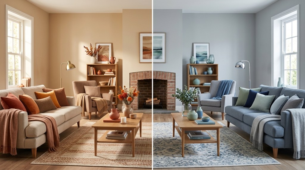
Understanding Warm and Cool Colors
Before exploring individual colors, it’s important to understand the two main color families.
Warm Colors
Warm colors include:
- Red
- Orange
- Yellow
- Warm beige
- Terracotta
Warm colors often create feelings of:
- Energy
- Warmth
- Comfort
- Excitement
These colors tend to make spaces feel more intimate and welcoming.
Cool Colors
Cool colors include:
- Blue
- Green
- Purple
- Cool gray
Cool colors are associated with:
- Calmness
- Relaxation
- Freshness
- Focus
These colors often make rooms feel larger and more open.
How Different Colors Affect Mood
Let’s explore the psychological effects of the most commonly used colors in home decor.
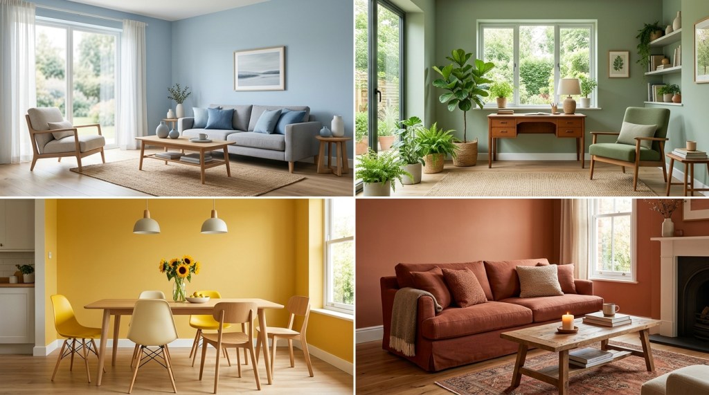
Blue: Calm, Peaceful, and Relaxing
Blue is one of the most popular colors in interior design.
It is often associated with:
- Serenity
- Stability
- Trust
- Relaxation
Because of its calming effect, blue works particularly well in spaces designed for rest and focus.
Best Rooms for Blue
- Bedrooms
- Home offices
- Reading nooks
- Bathrooms
Decorating Tip
Pair blue with:
- White
- Gray
- Natural wood
This combination creates a fresh and timeless appearance.
Green: Balanced, Natural, and Refreshing
Green is strongly connected to nature.
It represents:
- Growth
- Balance
- Renewal
- Harmony
Many designers consider green one of the most versatile colors because it combines the calming qualities of blue with the warmth of yellow.
Best Rooms for Green
- Living rooms
- Bedrooms
- Home offices
- Kitchens
Decorating Tip
Sage green and olive green are particularly popular in modern home decor because they feel sophisticated and relaxing.
Yellow: Cheerful, Optimistic, and Inviting
Yellow is often associated with sunshine and happiness.
It can create feelings of:
- Positivity
- Warmth
- Energy
- Optimism
However, very bright yellow can become overwhelming when overused.
Best Rooms for Yellow
- Kitchens
- Breakfast nooks
- Entryways
- Family rooms
Decorating Tip
Soft buttery yellows often work better than extremely bright shades.
Red: Energetic, Bold, and Stimulating
Red is one of the most emotionally intense colors.
It is linked to:
- Passion
- Energy
- Excitement
- Confidence
Because red stimulates activity, it is usually best used as an accent rather than a dominant color.
Best Rooms for Red
- Dining rooms
- Entertainment spaces
- Accent walls
Decorating Tip
Use red through:
- Cushions
- Artwork
- Decorative accessories
A little red can make a big impact.
Orange: Warm, Friendly, and Social
Orange combines the energy of red with the cheerfulness of yellow.
It creates feelings of:
- Enthusiasm
- Warmth
- Creativity
- Friendliness
Best Rooms for Orange
- Home gyms
- Playrooms
- Creative workspaces
Decorating Tip
Terracotta and burnt orange are popular alternatives that feel more sophisticated than bright orange.
Purple: Luxurious, Creative, and Elegant
Purple has long been associated with luxury and creativity.
Different shades create different moods.
Light Purple
Feels:
- Soft
- Romantic
- Peaceful
Dark Purple
Feels:
- Rich
- Dramatic
- Sophisticated
Best Rooms for Purple
- Bedrooms
- Reading spaces
- Accent areas
White: Clean, Open, and Timeless
White remains one of the most widely used colors in home decor.
It creates feelings of:
- Simplicity
- Cleanliness
- Spaciousness
White also reflects light, making rooms feel larger.
Best Rooms for White
- Any room
- Small spaces
- Modern interiors
Decorating Tip
Add texture through:
- Wood
- Fabric
- Natural materials
This prevents white rooms from feeling sterile.
Gray: Sophisticated and Versatile
Gray is often used as a neutral foundation.
It can feel:
- Elegant
- Modern
- Calm
The key is choosing the right undertone.
Warm Gray
Feels cozy and inviting.
Cool Gray
Feels sleek and contemporary.
Decorating Tip
Pair gray with:
- Wood tones
- Green accents
- Soft textiles
To maintain warmth.
Beige and Earth Tones: Comfortable and Timeless
Earth tones have become increasingly popular because they create warmth without overwhelming a space.
Examples include:
- Beige
- Sand
- Taupe
- Terracotta
- Clay
These colors create a welcoming atmosphere.
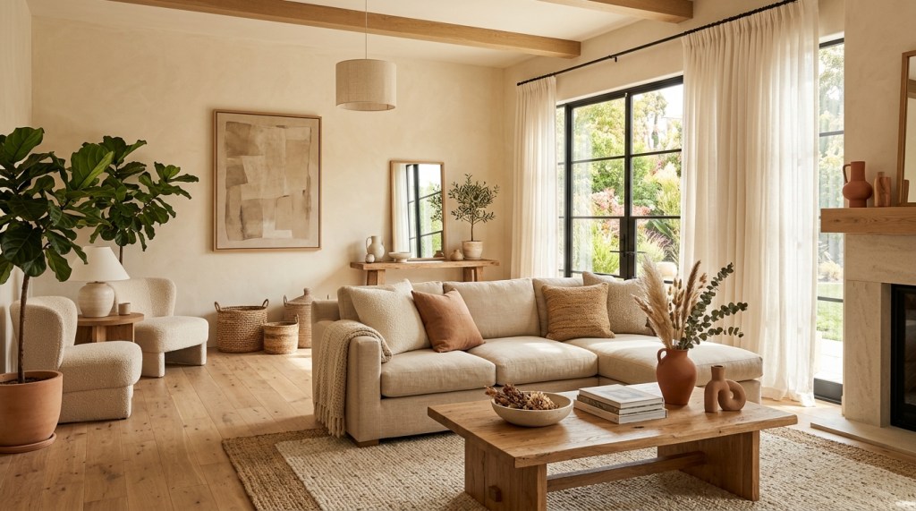
Best Rooms for Earth Tones
- Living rooms
- Bedrooms
- Dining rooms
Decorating Tip
Combine earth tones with natural materials such as wood, linen, and woven textures.
Black: Dramatic and Sophisticated
Black can add elegance and contrast when used carefully.
It often communicates:
- Luxury
- Strength
- Sophistication
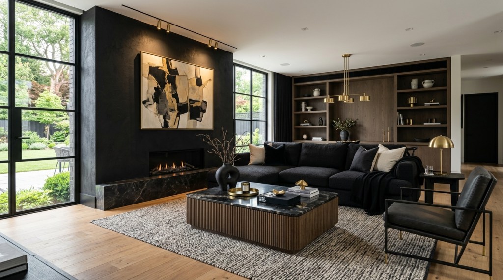
Best Uses for Black
- Furniture
- Lighting fixtures
- Accent walls
- Decorative accessories
Decorating Tip
Use black strategically rather than excessively.
Too much black can make a room feel heavy.
Choosing Colors Based on Room Purpose
One of the best ways to choose colors is to consider how the room will be used.
Living Room
Goals:
- Comfort
- Conversation
- Relaxation
Good choices:
- Warm neutrals
- Sage green
- Soft blue
Bedroom
Goals:
- Rest
- Relaxation
- Comfort
Good choices:
- Blue
- Green
- Soft gray
- Beige
Kitchen
Goals:
- Energy
- Warmth
- Activity
Good choices:
- White
- Yellow
- Warm neutrals
Home Office
Goals:
- Focus
- Productivity
Good choices:
- Blue
- Green
- Neutral tones
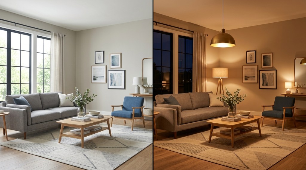
How Lighting Affects Color
Colors do not look the same under every lighting condition.
Natural and artificial lighting can dramatically change how a color appears.
For example:
- Beige may appear warmer in sunlight.
- Gray may appear cooler in shadow.
- Blue may appear darker in dim lighting.
Always test paint samples under different lighting conditions before making a final decision.
Common Color Mistakes
Choosing Colors Based Only on Trends
Trendy colors may not suit your home or lifestyle.
Ignoring Natural Light
Lighting affects how colors appear throughout the day.
Using Too Many Colors
Too many unrelated colors can create visual chaos.
Forgetting Texture
Color works best when combined with varied materials and textures.
Creating a Cohesive Color Palette
For a balanced home, choose:
2–3 Primary Colors
Examples:
- White
- Beige
- Gray
1–2 Accent Colors
Examples:
- Navy blue
- Sage green
- Terracotta
Repeating these colors throughout your home creates visual flow and cohesion.
How Color Connects to Other Design Principles
Color works alongside:
- Scale
- Balance
- Texture
- Style
- Lighting
For a deeper understanding, read:
- What Is Home Decor? A Complete Beginner’s Guide
- How to Choose a Home Decor Style
- Texture in Home Decor: How Wood, Metal, Fabric, and Other Materials Transform a Space
- How to Create a Cohesive Look Across Your Home
- How to Plan Home Decor Before Buying Anything
These guides will help you make more informed decorating decisions.
The Bottom line
Color is far more than a decorative choice. It influences how a room feels, how people behave, and how comfortable a space becomes. By understanding color psychology, you can create interiors that support relaxation, productivity, creativity, or social interaction depending on your goals.
Whether you’re choosing paint colors, furniture, wall art, or decorative accessories, always consider the mood you want to create. The best color palettes are not only beautiful—they enhance the way you live in your home.
This post is part of our Home Decor Guidance Series. In the next guide, we’ll explore Best Colors for Living Rooms: Creating Comfort and Style, where you’ll learn how to select living room colors that feel inviting, timeless, and perfectly suited to your space.

Leave a comment