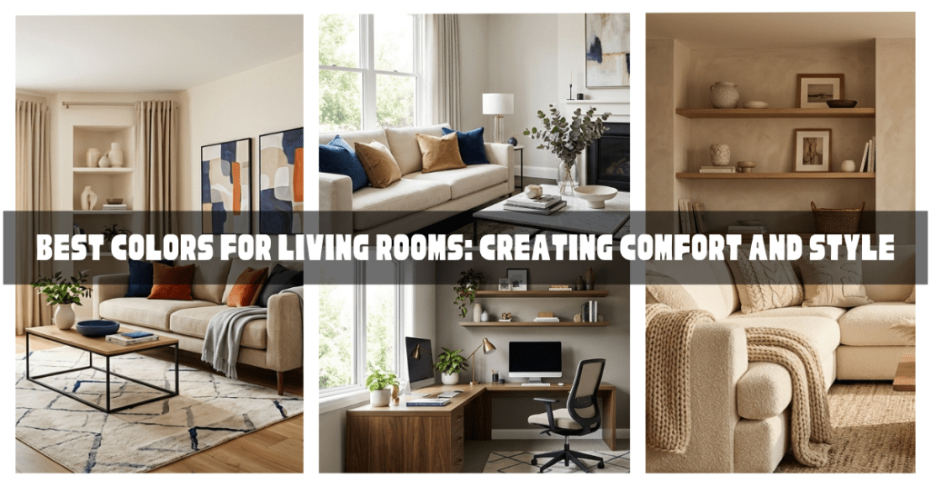
The living room is often considered the heart of the home. It’s where families gather, guests are entertained, conversations happen, and everyday life unfolds. Because of its importance, choosing the right color palette for your living room can significantly impact how comfortable, welcoming, and stylish the space feels.
The best living room colors are not just visually appealing—they support the mood and function of the room while complementing your overall home decor style.
In this guide, you’ll learn how to choose the best colors for your living room, understand the emotional effects of different color palettes, and discover practical tips for creating a space that feels both comfortable and stylish.
Why Living Room Color Matters
Color affects how a room feels and how people respond to it.
The right color can make a living room feel:
- Warm and inviting
- Calm and relaxing
- Bright and spacious
- Elegant and sophisticated
- Modern and stylish
The wrong color can make a room feel:
- Cold
- Overwhelming
- Dark
- Uncomfortable
- Smaller than it actually is
Since the living room is one of the most frequently used spaces in a home, color selection deserves careful consideration.
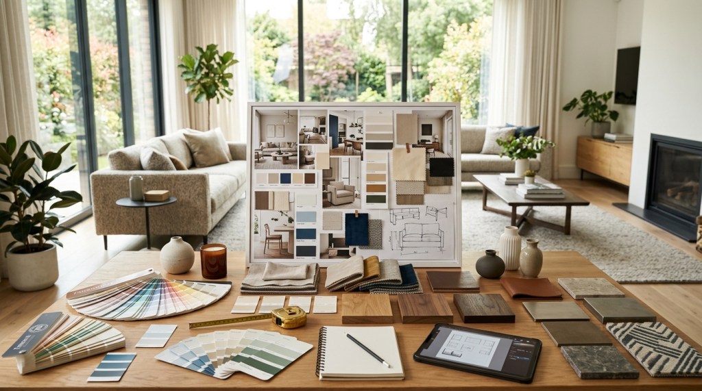
Factors to Consider Before Choosing a Living Room Color
Before selecting paint, furniture, or decorative accessories, consider the following:
Room Size
Small rooms often benefit from lighter colors.
Large rooms can comfortably handle darker shades.
Natural Light
A room with abundant sunlight can support a wider range of colors.
A darker room may require lighter shades to feel bright and welcoming.
Existing Furniture
Your wall color should complement:
- Sofas
- Rugs
- Curtains
- Artwork
- Decorative accessories
Home Decor Style
Different styles often favor different color palettes.
For example:
- Modern homes often use neutrals.
- Boho interiors embrace earth tones.
- Scandinavian spaces favor light colors.
If you haven’t already, read:
How to Choose a Home Decor Style
The Most Popular Living Room Color Categories
Let’s explore the colors that consistently work well in living rooms.
White: Clean, Bright, and Timeless
White remains one of the most popular living room colors.
It creates:
- Openness
- Simplicity
- Brightness
White also acts as a versatile backdrop for nearly any decorating style.
Why Homeowners Love White
White:
- Reflects natural light
- Makes rooms appear larger
- Pairs well with all colors
- Supports modern and traditional styles
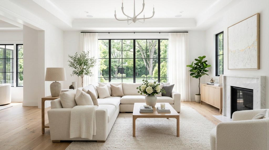
Best Pairings
White works beautifully with:
- Natural wood
- Black accents
- Green plants
- Neutral textiles
Potential Drawback
Too much white can feel sterile if texture is missing.
Add:
- Wood furniture
- Woven baskets
- Linen curtains
- Area rugs
To create warmth.
Beige: Warm and Inviting
Beige has made a strong comeback in recent years.
Unlike stark white, beige introduces warmth and comfort.
Why Beige Works
Beige feels:
- Cozy
- Relaxing
- Timeless
- Versatile
It creates an inviting atmosphere without overwhelming the space.
Best Styles for Beige
- Traditional
- Modern organic
- Scandinavian
- Farmhouse
- Transitional
Decorating Tip
Layer different shades of beige for a sophisticated look.
Examples:
- Beige walls
- Cream sofa
- Light wood furniture
Gray: Elegant and Versatile
Gray has been a favorite living room color for years because of its flexibility.
Warm Gray vs. Cool Gray
Warm Gray
Feels:
- Cozy
- Comfortable
- Inviting
Cool Gray
Feels:
- Contemporary
- Clean
- Minimalist
Best Pairings
Gray works well with:
- Navy blue
- White
- Black
- Green
- Wood tones
Decorating Tip
Avoid making the room feel cold by incorporating soft textures and natural materials.
Sage Green: Relaxing and Nature-Inspired
Sage green has become one of the most popular living room colors in modern home decor.
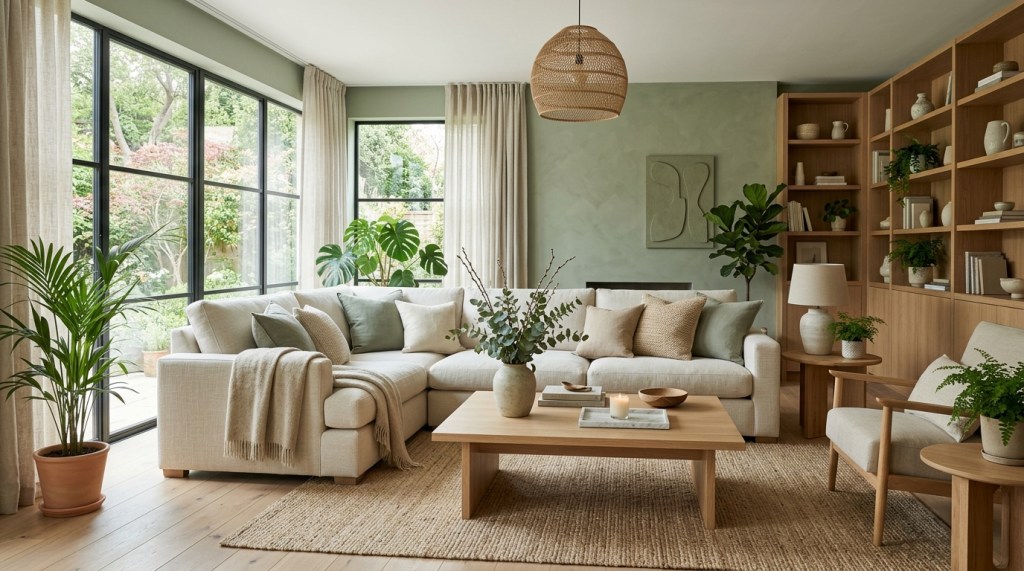
Why People Love Sage Green
It creates feelings of:
- Calmness
- Balance
- Freshness
- Connection to nature
Works Well With
- White
- Beige
- Wood furniture
- Black accents
Best Styles
- Modern organic
- Scandinavian
- Boho
- Farmhouse
Sage green offers color without overwhelming the room.
Navy Blue: Sophisticated and Timeless
Navy blue adds depth and elegance.
It is often associated with:
- Stability
- Confidence
- Sophistication
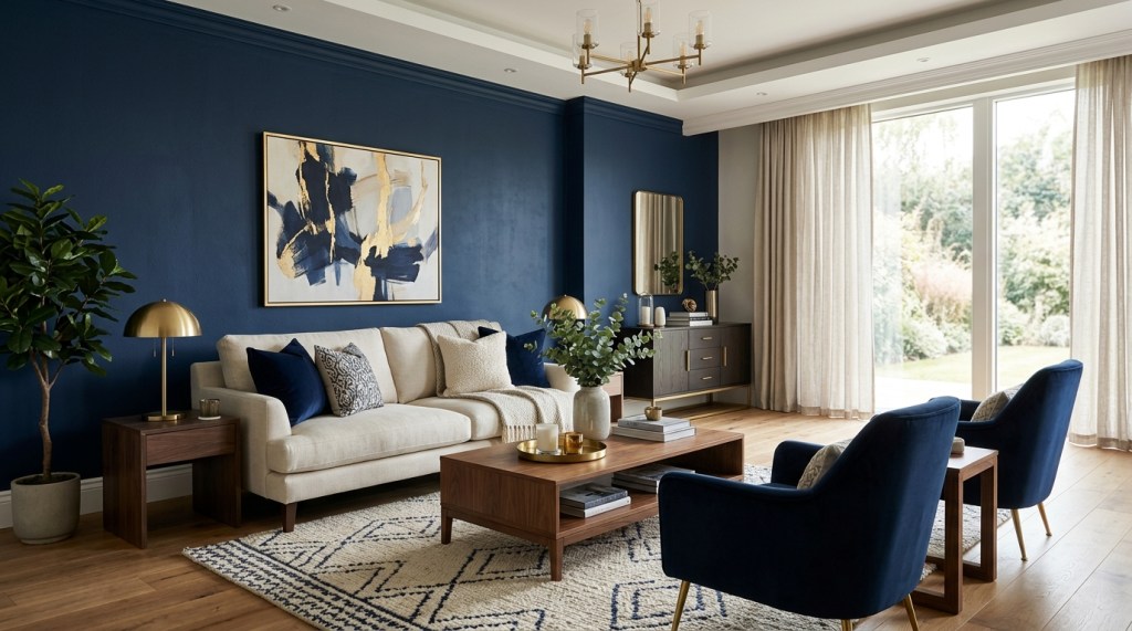
Why Navy Works
Unlike brighter blues, navy acts almost like a neutral.
It pairs beautifully with:
- White
- Gold accents
- Gray
- Beige
- Wood tones
Best Uses
- Accent walls
- Furniture
- Decorative accessories
Decorating Tip
Balance navy with lighter colors to prevent the room from feeling too dark.
Earth Tones: Warm and Welcoming
Earth tones continue to dominate interior design trends.
Popular examples include:
- Terracotta
- Clay
- Sand
- Taupe
- Warm beige
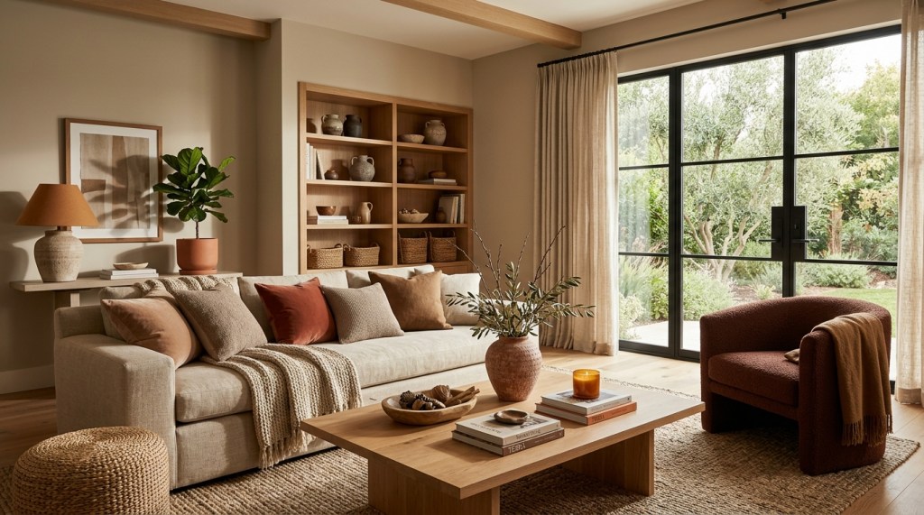
Why Earth Tones Work
They create:
- Warmth
- Comfort
- Natural beauty
Earth tones feel inviting and timeless.
Best Pairings
Combine with:
- Wood furniture
- Linen fabrics
- Woven textures
- Green plants
Soft Blue: Calm and Comfortable
Soft blue creates a relaxing environment without feeling overly formal.
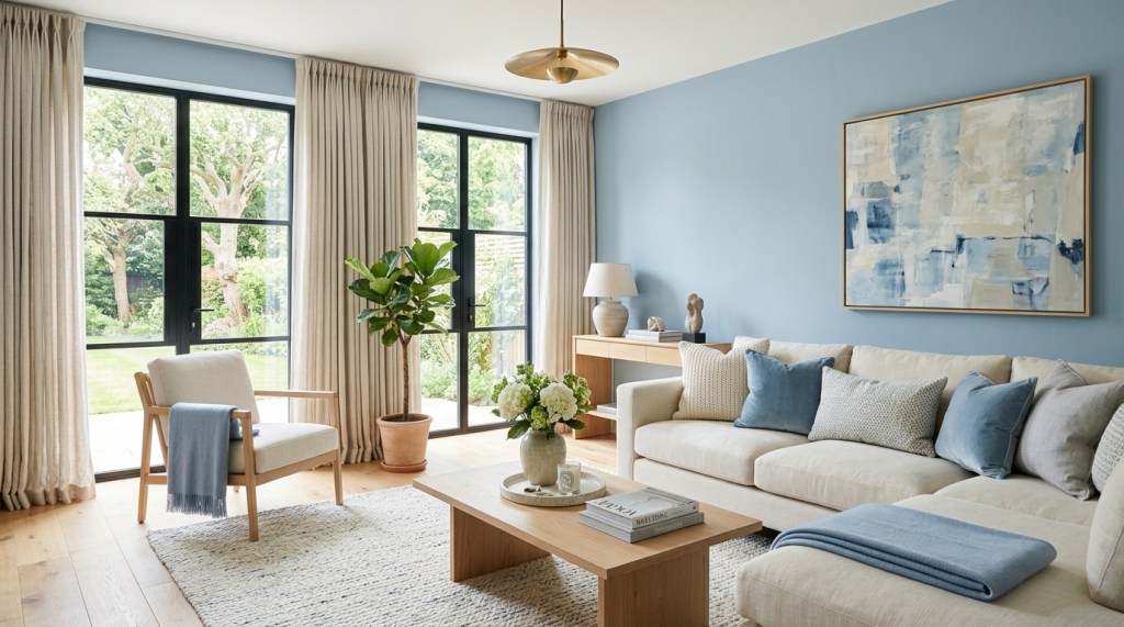
Benefits
Soft blue can make a room feel:
- Peaceful
- Airy
- Open
- Comfortable
Ideal For
- Coastal interiors
- Transitional styles
- Relaxed family rooms
Decorating Tip
Pair soft blue with white trim and natural materials.
Greige: The Perfect Neutral Blend
Greige combines gray and beige.
It has become extremely popular because it offers:
- Warmth
- Sophistication
- Flexibility
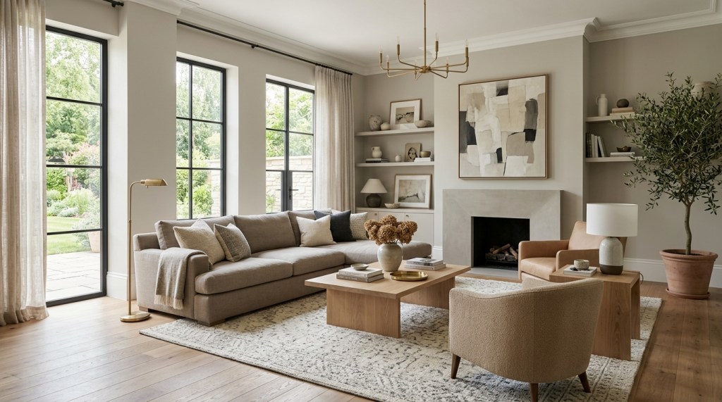
Why Designers Love Greige
Greige adapts well to:
- Modern homes
- Traditional interiors
- Contemporary spaces
Best Pairings
- Black accents
- White trim
- Natural wood
- Earth-tone accessories
Choosing Colors for Small Living Rooms
Small living rooms benefit from colors that create a sense of openness.
Recommended Colors
- White
- Light gray
- Soft beige
- Pale blue
- Light sage green
Additional Tip
Use mirrors to enhance brightness and visual space.
Choosing Colors for Large Living Rooms
Large rooms can handle richer, deeper colors.
Recommended Colors
- Navy blue
- Dark green
- Charcoal gray
- Warm taupe
- Terracotta
Why They Work
These colors create intimacy and visual warmth.
Large rooms often need additional visual weight.
Popular Living Room Color Combinations
Here are some proven combinations that consistently work well.
White + Wood + Black
Creates:
- Modern elegance
- Clean contrast
Beige + Cream + Wood
Creates:
- Warmth
- Comfort
- Timeless appeal
Sage Green + White + Oak
Creates:
- Freshness
- Natural beauty
Navy Blue + White + Gold
Creates:
- Sophistication
- Luxury
Gray + Beige + Green
Creates:
- Balance
- Modern comfort
How Lighting Affects Living Room Colors
Color never exists independently of light.
The same paint color can look completely different throughout the day.
Natural Light
Generally enhances color accuracy.
Warm Artificial Lighting
Makes colors appear warmer.
Cool Artificial Lighting
Can make colors appear cooler or more muted.
Always test paint samples under multiple lighting conditions before committing.
Common Living Room Color Mistakes
Choosing Colors Without Testing Samples
Paint often looks different on walls than it does in stores.
Ignoring Natural Light
Lighting dramatically affects color perception.
Following Trends Blindly
Choose colors you genuinely enjoy living with.
Using Too Many Colors
Limit your palette to maintain visual harmony.
Forgetting Texture
Color alone cannot create depth.
Combine colors with:
- Wood
- Fabric
- Metal
- Natural materials
For a richer design.
Creating a Cohesive Living Room
A successful living room combines:
- Color
- Texture
- Lighting
- Furniture
- Decorative accessories
For additional guidance, read:
- Color Psychology in Home Decor: How Colors Affect Mood
- Texture in Home Decor
- How to Create a Cohesive Look Across Your Home
- How to Plan Home Decor Before Buying Anything
These guides will help you create a more balanced and intentional living space.
The Bottem Line
The best living room color is one that supports the mood, function, and style of your home. Whether you prefer crisp whites, calming sage greens, cozy beiges, or sophisticated navy blues, the goal is to create a space that feels comfortable and welcoming.
Remember that color is only one part of the design equation. Texture, lighting, furniture placement, and decorative accessories all contribute to the overall atmosphere.
When thoughtfully combined, these elements create a living room that is both stylish and enjoyable to spend time in.

Leave a comment