

Choosing the right colors for your living room can completely change how the space looks and feels. The right combination can make a room feel warmer, brighter, more relaxing, or even more sophisticated. But with so many shades to choose from, it’s easy to feel unsure about where to start.
Should you go with warm beige, soft white, earthy green, or something a little bolder? And how do you make sure your wall color works with your sofa, curtains, flooring, and other furniture?
The secret isn’t choosing the most popular color or copying an entire room from Pinterest. It’s finding a combination that works with your natural light, existing furniture, and the atmosphere you want to create.
In this guide, we’ll explore 15 living room color ideas, from timeless neutral combinations to richer, more expressive palettes. You’ll also find practical ways to bring each look into your home without making the space feel overwhelming.
1. Warm Beige and Cream for a Soft, Timeless Look
Warm beige and cream are a beautiful choice if you want a living room that feels comfortable, bright, and easy to decorate. Unlike cooler whites, these shades have a gentle warmth that makes a space feel more inviting.
You can use creamy white on the walls and introduce beige through your sofa, curtains, rugs, and cushions. Natural wood furniture works particularly well with this combination because it adds another layer of warmth.
How to use this combination:
- Choose warm white or cream for the main walls.
- Add a beige sofa or upholstered accent chair.
- Use natural wood furniture to create contrast.
- Bring in texture through woven rugs, linen curtains, and soft cushions.
A small detail that makes a difference: Avoid using exactly the same beige shade everywhere. Mix lighter and deeper tones so the room has dimension instead of looking flat.
2. Sage Green and Warm White for a Calm Atmosphere
Sage green is a lovely option when you want to introduce color without making your living room feel too bold. Its muted, natural appearance works beautifully with warm white, cream, light wood, and soft beige.
You don’t need to paint every wall green to enjoy this palette. A sage accent wall, green armchair, or a few carefully chosen accessories can create a similar effect.
Try this combination:
- Warm white walls.
- Sage green cushions or an accent chair.
- Light oak or natural wood furniture.
- Cream curtains and a neutral area rug.
If you enjoy a nature-inspired interior, add a few indoor plants. Their deeper green leaves can complement the softer sage shades.
3. Navy Blue and White for a Fresh, Elegant Living Room
Navy blue and white create a classic contrast that can make a living room feel polished without looking overly formal. Navy adds depth, while white keeps the space feeling open and balanced.
This combination is particularly attractive in rooms with plenty of natural light. In darker rooms, use navy more selectively so it doesn’t make the space feel smaller.
Ways to introduce navy:
- Use navy cushions on a white or cream sofa.
- Choose a navy accent chair.
- Add blue artwork against a light-colored wall.
- Introduce white or pale wood furniture to balance the darker shade.
For a softer result, mix navy with warm ivory rather than a very bright, cool white.
4. Terracotta and Beige for an Earthy, Welcoming Space
Terracotta brings warmth and personality into a living room. Its reddish-brown undertones look especially good with beige, cream, natural wood, and textured fabrics.
This palette is ideal if you like interiors that feel relaxed, slightly rustic, and connected to nature.
You could use terracotta on one feature wall, but there are easier ways to introduce it. Try cushions, ceramic vases, artwork, or a patterned rug featuring earthy shades.
Styling tip: Combine terracotta with natural materials such as wood, jute, rattan, and linen. These finishes help the color feel balanced rather than overpowering.
5. Charcoal Grey and Soft White for a Modern Interior
If you prefer a contemporary look, charcoal grey and soft white can create a clean, sophisticated living room.
The darker shade gives the space definition, while white prevents the overall palette from becoming too heavy. You can also introduce lighter grey tones to make the transition between the two colors feel more natural.
Make it work with:
- Soft white walls.
- A charcoal sofa or accent chair.
- Light grey cushions and throws.
- Black metal details and warm wood furniture.
One thing to remember: charcoal can look almost black in a room with limited daylight. Test a paint sample before committing to a large wall.
6. Olive Green and Natural Wood for an Organic Feel
Olive green is deeper and warmer than sage, making it a good option if you want a more grounded, character-filled living room.
It pairs beautifully with walnut furniture, cream upholstery, warm beige, and brass accents. You can use olive green on the walls or keep it to a few statement pieces.
A simple palette to try:
- Muted olive green.
- Warm cream.
- Medium or dark natural wood.
- Small brass or antique-gold details.
This combination works especially well when the room includes natural textures. Think wooden coffee tables, woven baskets, linen cushions, and textured rugs.
7. Dusty Blue and Beige for a Relaxed Living Room
Dusty blue offers a softer alternative to navy. It has a muted appearance that feels comfortable and easy to combine with neutral shades.
Pair it with beige walls, cream upholstery, light wood, and subtle white accents. The result is a balanced palette that works in both traditional and modern homes.
You can introduce dusty blue through curtains, cushions, an area rug, or a painted accent wall.
Keep the look cohesive: Repeat the same blue shade in two or three places rather than introducing several unrelated blues.
8. Chocolate Brown and Cream for a Rich, Cozy Look
Brown is a wonderful way to make a living room feel warm and grounded. Chocolate brown, in particular, creates a rich contrast when paired with cream and ivory.
You can bring this color into the room through a leather sofa, wooden furniture, cushions, or a darker accent wall.
For a balanced result, let cream and other light neutrals occupy the larger surfaces. Use chocolate brown as the deeper supporting color.
Try adding:
- Cream walls or curtains.
- A chocolate-brown sofa or accent chair.
- Walnut or dark oak furniture.
- Warm lighting and textured fabrics.
If you’re working with a small living room, use brown selectively and keep the larger surfaces lighter.
9. Blush Pink and Warm Grey for a Gentle, Modern Palette
Blush pink doesn’t have to make a living room look overly sweet. When paired with warm grey, cream, and natural wood, it can feel understated and contemporary.
The trick is choosing a muted pink rather than a very bright shade.
Use blush in small doses through cushions, artwork, a decorative chair, or a rug. Warm grey can provide a neutral foundation without competing with the pink.
Best finishing touch: Add a little brushed brass or warm wood to give the combination more depth.
10. Black and Warm Beige for Bold Contrast
Black and beige are a strong combination for anyone who likes a modern interior with a little drama.
Beige softens the appearance of black, while black adds definition to a neutral room. You don’t need large black surfaces to create this effect.
Consider black picture frames, lighting fixtures, coffee table legs, or a statement side table against warm beige walls.
Avoid this mistake: Using too much black in a room that already has limited natural light. Keep it as an accent and allow beige, cream, or warm white to do most of the visual work.
11. Forest Green and Cream for a Sophisticated Look
Forest green is a deeper, more dramatic alternative to sage and olive. It can make a living room feel rich and distinctive, especially when paired with cream, walnut, and brass.
A forest-green feature wall behind a neutral sofa can create a beautiful focal point. You could also choose a green velvet accent chair or introduce the color through artwork and cushions.
A useful combination:
- Forest green.
- Warm cream.
- Dark walnut.
- Brushed brass.
This palette works particularly well when the room has good natural light or layered artificial lighting.
12. Muted Yellow and Soft White for a Cheerful Space
If your living room feels a little dull, muted yellow can bring in warmth and brightness without looking too loud.
Choose shades such as soft butter yellow or pale ochre rather than intense lemon yellow. These tones work nicely with white, beige, light wood, and natural fabrics.
Use yellow in an accent chair, cushions, curtains, or artwork. You can also introduce it through a patterned rug.
Styling tip: Keep the surrounding colors simple. A few yellow details will stand out more beautifully when the rest of the room has a calm neutral foundation.
13. Burgundy and Cream for a Rich, Characterful Interior
Burgundy adds depth and personality to a living room. It’s a strong choice if you enjoy deeper colors but don’t want to rely entirely on black, navy, or dark green.
Pair it with cream, warm beige, walnut, and subtle gold details. A burgundy accent chair or a set of cushions can be enough to introduce the shade.
For a more dramatic look, consider a burgundy feature wall. Just make sure the room has enough light and that the remaining furniture doesn’t compete with it.
14. Greige and Natural Wood for an Effortlessly Coordinated Look
Greige, a blend of grey and beige, is a useful choice if you find traditional grey too cool and beige too warm.
It creates a flexible background that works with many furniture styles and decorative finishes.
Pair greige walls with natural wood, cream upholstery, and soft brown accessories. You can also add muted green or dusty blue for a little more character.
Why it’s practical: Greige is easy to update. You can change your cushions, curtains, or artwork without needing to repaint the entire room.
15. Deep Blue and Warm Brown for a Moody, Stylish Space
Deep blue and warm brown create a rich combination that feels both modern and comfortable. The blue adds depth, while brown introduces warmth through wood, leather, and textured furniture.
Try deep blue on an accent wall and use brown through a leather chair, wooden coffee table, or decorative accessories.
To prevent the room from looking too dark, add cream upholstery, warm lighting, and a lighter rug.
This is a good palette if you want a more dramatic living room without making every surface a dark color.
How to Choose the Right Living Room Color Combination
Looking at beautiful color combinations is the easy part. Choosing one that actually works in your own living room takes a little more thought.
Before buying paint or replacing furniture, consider these five things.
1. Pay Attention to Natural Light
A color can look very different depending on the amount of daylight a room receives.
- North-facing rooms: Warm whites, creamy beige, and earthy tones can help soften cooler light.
- South-facing rooms: Many colors work well because these rooms often receive stronger natural light.
- East-facing rooms: Consider how the color looks in the morning compared with the afternoon.
- West-facing rooms: Check how the shade changes in warmer evening light.
Always test paint samples on the actual wall before making a final decision.
2. Start With Your Largest Furniture Piece
If you already own a sofa, rug, or large piece of furniture, use it as your starting point.
For example, a beige sofa gives you plenty of flexibility. You could introduce sage green, dusty blue, terracotta, or chocolate brown around it.
A colorful sofa may require a more restrained wall color and simpler accessories.
The goal is to create a palette where the major pieces work together rather than compete for attention.
3. Follow the 60-30-10 Color Rule
A simple way to balance a living room palette is the 60-30-10 rule.
- 60% dominant color: Usually walls, large rugs, or major background surfaces.
- 30% secondary color: Sofas, curtains, or larger furniture pieces.
- 10% accent color: Cushions, artwork, lamps, and smaller accessories.
This isn’t a strict decorating law. It’s simply a helpful starting point when you’re unsure how much of each color to use.
4. Consider Your Flooring and Curtains
Your floor and curtains occupy a noticeable amount of visual space, so they should be part of your color plan.
Warm wooden floors often look good with cream, beige, olive, and earthy shades. Cooler grey flooring may work better with certain blues, greiges, and soft whites.
If you’re replacing curtains, our complete guide to choosing curtains can help you consider fabric, length, and color before buying.
5. Test Colors Before Committing
Never choose a paint color based only on a small online picture.
Buy sample pots or paint sample boards and check them at different times of the day. Look at them alongside your sofa, flooring, curtains, and other large items.
A color that looks beautiful in a Pinterest photo might look completely different in your home.
Five Amazon Products That Can Help Complete Your Living Room Color Scheme
Once you’ve chosen your palette, a few carefully selected accessories can help bring everything together. You don’t need to replace all your furniture. Start with pieces that introduce your chosen colors naturally.
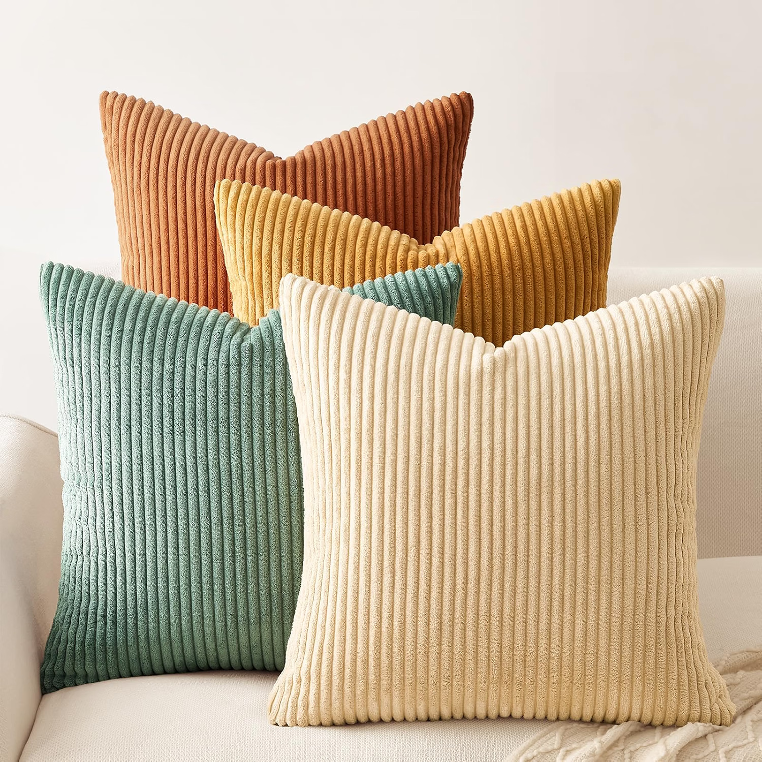
1. Decorative Throw Pillow Covers
Best for: Adding an accent color without replacing your sofa.
Why they fit: Cushion covers are an affordable way to introduce sage green, dusty blue, terracotta, burgundy, or other colors. You can also change them seasonally.
Key features to look for:
- Removable covers.
- Durable fabric.
- Colors that coordinate with your existing furniture.
One thing to consider: Check the dimensions before ordering so the covers fit your existing cushion inserts.
Check the Latest Price on Amazon
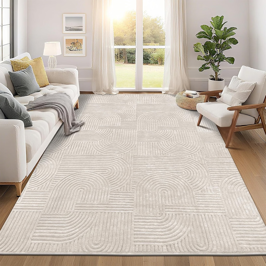
2. Neutral Textured Area Rug
Best for: Creating a balanced foundation for your color scheme.
Why it fits: A cream, beige, or greige rug can connect different furniture pieces and soften the appearance of a living room.
Key features to look for:
- A suitable size for your seating arrangement.
- Easy-care material.
- A texture that works with your furniture and flooring.
One thing to consider: A very light rug may need more frequent cleaning in a busy household.
Check the Latest Price on Amazon
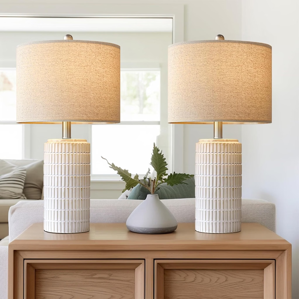
3. Table Lamp With a Warm Light
Best for: Making deeper colors feel more comfortable and inviting.
Why it fits: Warm lighting can complement earthy shades, brown furniture, forest green, and other rich palettes. It also creates a softer atmosphere in the evening.
Key features to look for:
- A stable base.
- A shade that suits your interior.
- A warm-white compatible bulb.
One thing to consider: Check the lamp’s height and dimensions so it doesn’t overwhelm a small side table.
Check the Latest Price on Amazon
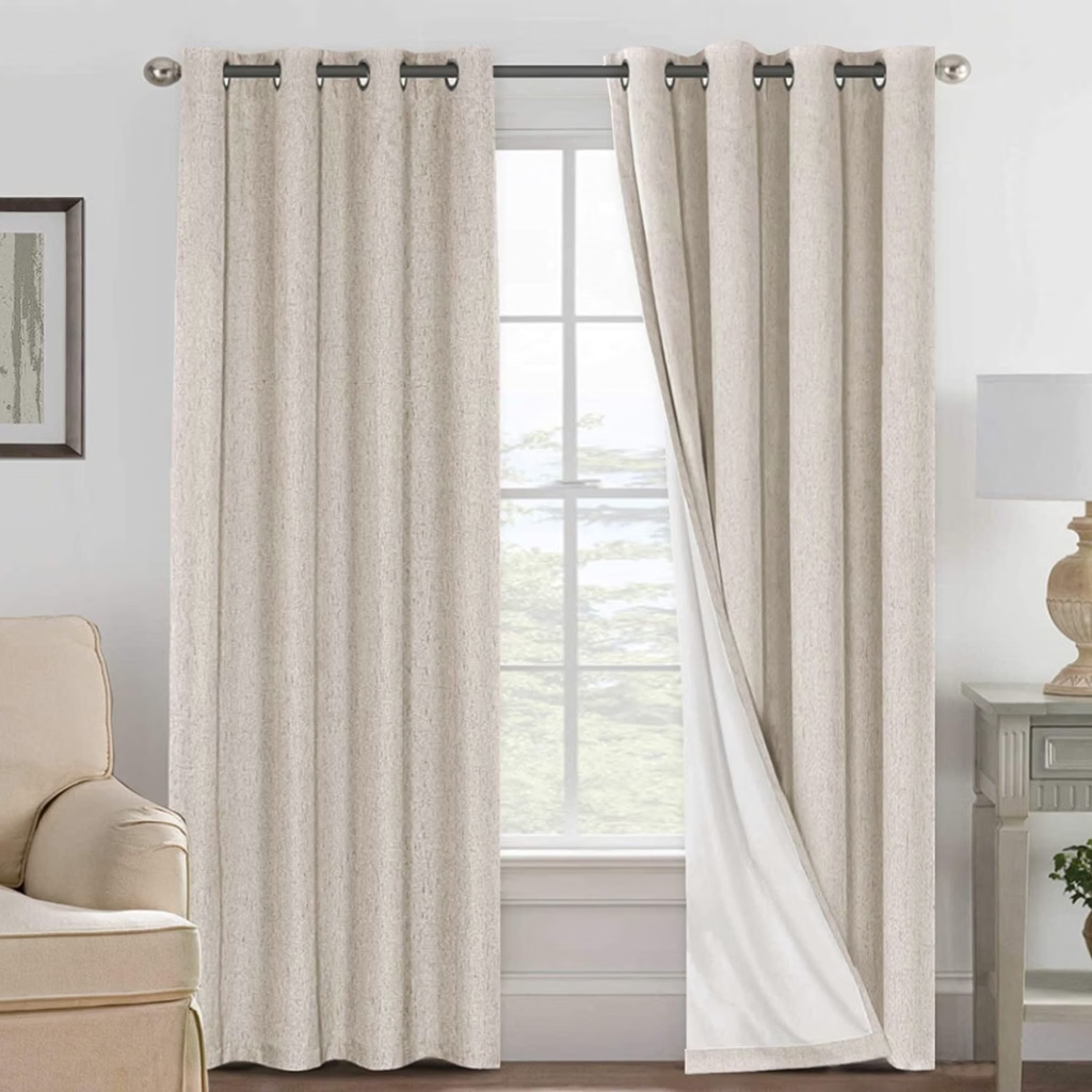
4. Neutral or Earth-Tone Curtains
Best for: Connecting your wall color with the rest of the room.
Why they fit: Curtains in cream, beige, taupe, or muted earthy shades can help create a more coordinated appearance without adding another competing color.
Key features to look for:
- Correct panel width and length.
- Fabric suitable for the amount of light you want.
- A color that complements your walls and flooring.
One thing to consider: Very heavy or dark curtains can make a small room feel visually heavier.
Check the Latest Price on Amazon
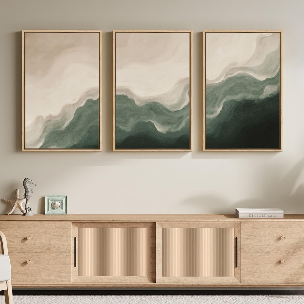
5. Framed Wall Art in Complementary Colors
Best for: Repeating your chosen palette across the room.
Why they fit: Artwork can bring together colors already used in your sofa, cushions, rug, and curtains. It also gives a room more personality.
Key features to look for:
- Colors that repeat your existing palette.
- Artwork sized appropriately for the wall.
- A frame that complements your furniture.
One thing to consider: Avoid choosing artwork with too many unrelated colors if you want a calm, coordinated look.
Check the Latest Price on Amazon
Common Living Room Color Mistakes to Avoid
Even beautiful colors can look disappointing when they’re used without a clear plan.
Here are a few mistakes worth avoiding:
- Choosing paint before considering furniture: Your sofa, rug, and flooring should influence the wall color.
- Using too many unrelated shades: A room can feel messy when every decorative item introduces a completely different color.
- Ignoring lighting: Paint colors change throughout the day, so always test samples first.
- Making every surface the same shade: Different tones, materials, and textures help create depth.
- Following Pinterest photos too literally: Use inspiration as a starting point, not a rulebook. Your room has its own lighting, dimensions, and furniture.
Final Thoughts
The best living room color ideas aren’t necessarily the boldest or most fashionable ones. They’re the combinations that make your space feel comfortable, balanced, and connected to your personal style.
If you prefer a timeless interior, start with warm beige, cream, or greige. If you want something more expressive, try sage green, terracotta, navy, or burgundy. And if you love a richer atmosphere, forest green, chocolate brown, and deep blue can create a beautiful result.
Take your time, test a few shades, and build the room around colors that work with what you already own. A thoughtful color scheme can make a noticeable difference without requiring a complete makeover.


